


End-of-quarter reporting and presentations are critical moments for teams to evaluate performance, share results, and align on future goals. But they can also be time-consuming and stressful. For non-designers, creating a comprehensive deck can take more time than the reporting which is misallocating valuable time.
That’s where Beautiful.ai comes in. Our platform simplifies the creation of compelling, data-driven presentations with Smart Slide templates that handle the heavy lifting of design.
If you’re feeling the pressure of the end-of-quarter crunch, Beautiful.ai’s Smart Slides can help streamline the presentation design process so you can focus on what really matters.
Why Smart Slide templates matter for end-of-quarter presentations
Smart Slide templates are a huge time-saver for end-of-quarter presentations, where clarity, speed, and impact are essential. Instead of getting bogged down in design and formatting, teams can leverage these AI-powered templates to build presentations faster and more efficiently. Most importantly, Smart Slides free you to concentrate on the content that counts: your performance insights, takeaways, and strategic narrative.
Top Beautiful.ai Smart Slide templates for EoQ presentations
As you wrap up the second quarter, and head into the second half of the year, leverage these seven Smart Slide templates to keep your team organized and on track.
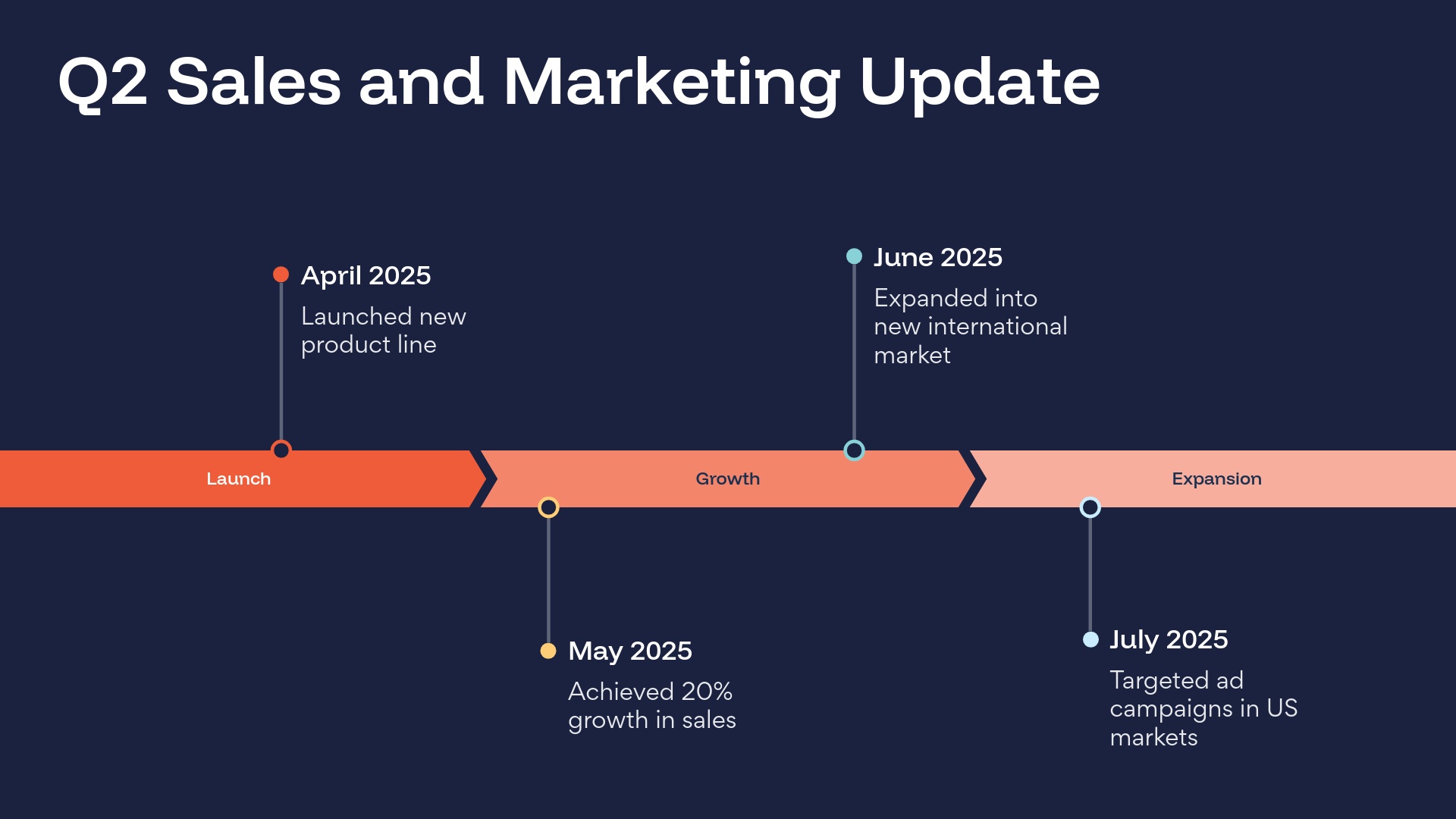
Timeline
A timeline is a visual representation marking all major events over a period of time. Timeline slides have many versatile uses—everything from project plans, to status updates, to “next steps” can be communicated using a timeline. When you’re wrapping up H1 and Q2, a timeline slide can help you track progress for different projects and goals.
SWOT
A SWOT analysis is an evaluation model used to help identify strengths, weaknesses, opportunities, and threats to a business, project, or opportunity. A typical SWOT diagram includes both potential internal and external factors and formats them into a single four-quadrant model. An effective SWOT analysis organizes data into four basic categories. A SWOT is a great tool to help identify opportunities for Q3 to shape new strategies and direction for the business.

Data Comparison
A data comparison template is similar to a bar graph, using bars of varying lengths to display measured data. The data comparison template, however, displays percentages instead of exact numbers. A data comparison can help teams identify growth and patterns quarter-over-quarter to determine opportunities for growth.

Photo Grid
While information you present in text is one of the most important elements in your presentation, your visual elements matter, too. A photo grid template can help your presentation tell a story visually without having to rely solely on text. You might use this template to show the faces behind a new team of employees, share progress on a big Q2 initiative, or cover wins from the quarter.

Gantt Chart
A Gantt chart is a visual view of tasks scheduled over time. It's a type of bar chart that shows the start and finish dates of several elements of a project that include: what the project tasks are, who is working on each task, how long each task will take, and how tasks group together, overlap, and link with each other. A Gantt is a great way to unlock better project management and facilitate better alignment across teams at the start of the new quarter.

Process Diagram
A process diagram is a type of flowchart that illustrates the relationships between major components of a process. It’s used to document, improve, or model a new process and make even the most complex, detailed processes more understandable, clear, and concise. This helps to not overwhelm anyone learning something new or taking on new responsibilities. A process diagram can be used to outline processes in Q3 and beyond for more seamless collaboration.

Data dashboard
There’s inevitably a lot of data to compile at the end of the quarter. Various reports can help teams identify what worked well in Q2, and where there’s room for improvement in Q3. But data can be complex. A data dashboard presentation slide template is great for big data dumps, or data-rich slides, that require more flexibility in design.


.webp)

